
Dashboard
Your headline numbers, the profit chart, and the books making or losing you the most money.
The dashboard answers one question: am I making money right now?
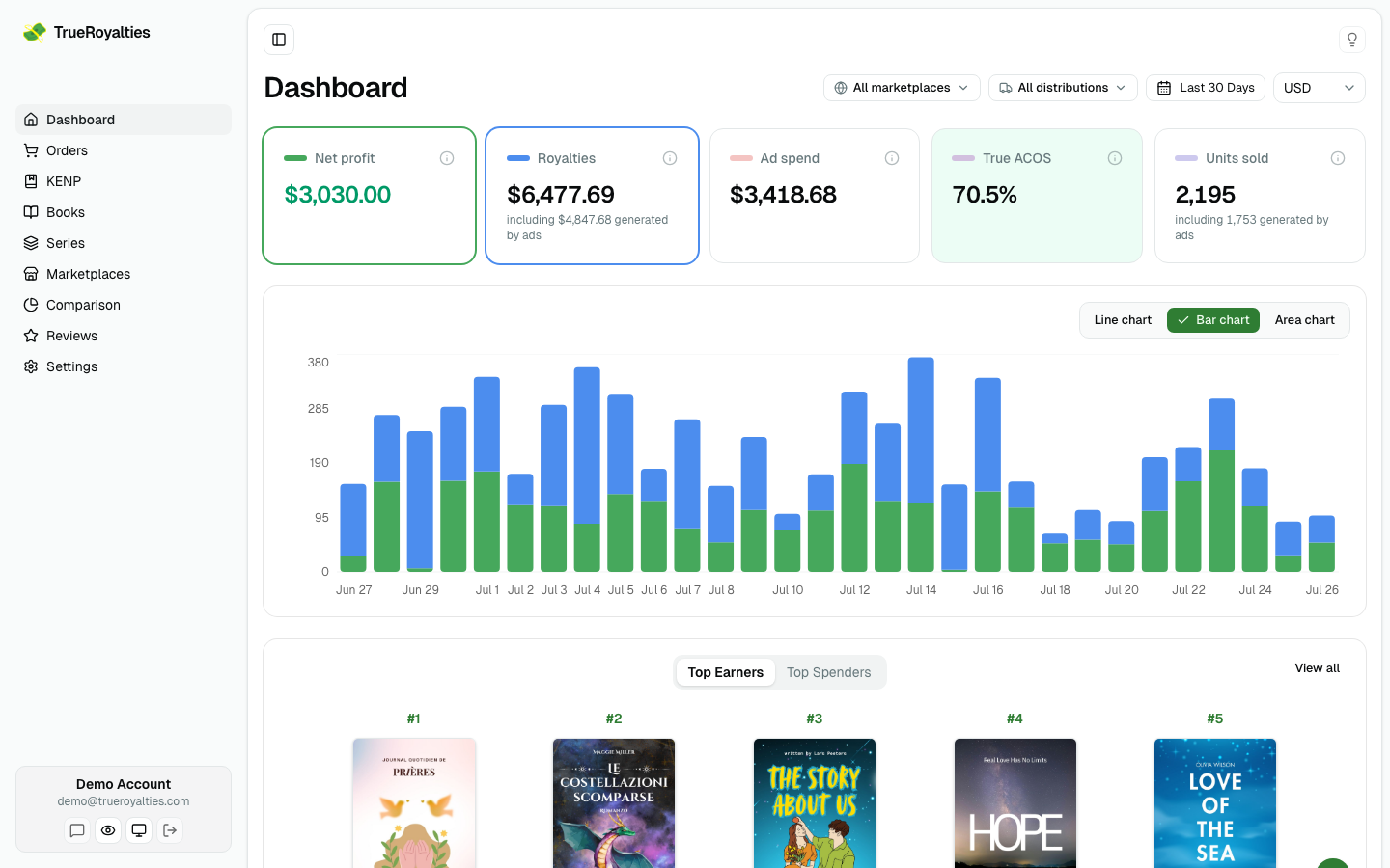
The cards

| Card | What it means |
|---|---|
| Net profit | Royalties kept minus ad spend. The number that matters |
| Royalties | Gross royalties, matching KDP, with the share your ads generated |
| Ad spend | Total Amazon Ads spend, VAT included |
| True ACOS | Ad spend ÷ ad-generated royalties. Under 100 % is profitable |
| Units sold | Copies sold, with the share your ads generated |
| Smart link clicks | How many people opened your smart links. Appears once you have one |
Click a card to change what the chart below plots. Selecting Smart link clicks draws them over your royalties and ad spend, on their own axis — what your marketing did, next to what it earned.
That card follows your marketplace filter, but it disappears when you filter by distribution: a click happens before the reader has chosen a channel, so it belongs to none of them.
The chart
Daily performance over the selected range, as bars, lines or an area. It follows the cards you select, so you can put royalties and ad spend side by side and see the gap.
Your preferred chart style is remembered in Settings → Preferences.
Top earners and top spenders
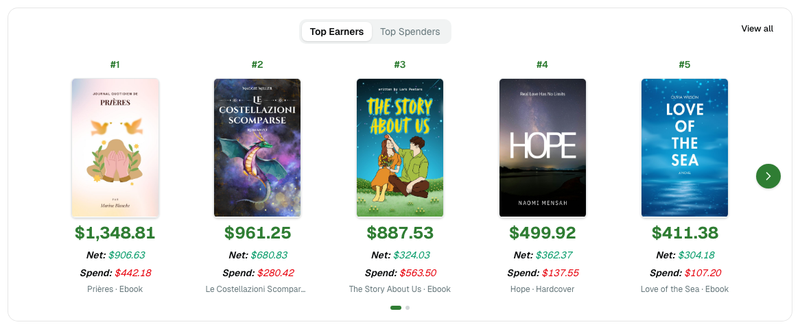
Two ranked views of the same catalog: the books earning the most, and the books spending the most. Switching between them is the fastest way to spot a title that sells well and still loses money.
Filters

Everything on the page reacts to:
- Marketplace — one store, or all of them
- Distribution — Amazon retail, Kindle Unlimited, Expanded Distribution
- Date range — presets or a custom range
- Currency — a display currency, without changing your reporting currency
Filters stay in the URL, so a filtered view can be bookmarked or shared.
Make it yours
Below the fixed cards, you can pin any chart from Comparison — or the Marketplaces table — and arrange them however you like. They follow the same filters as the rest of the page.
If a number looks wrong
Start with Why my numbers differ from KDP — most gaps are a date range, a currency, or a tax rate that has not been set.